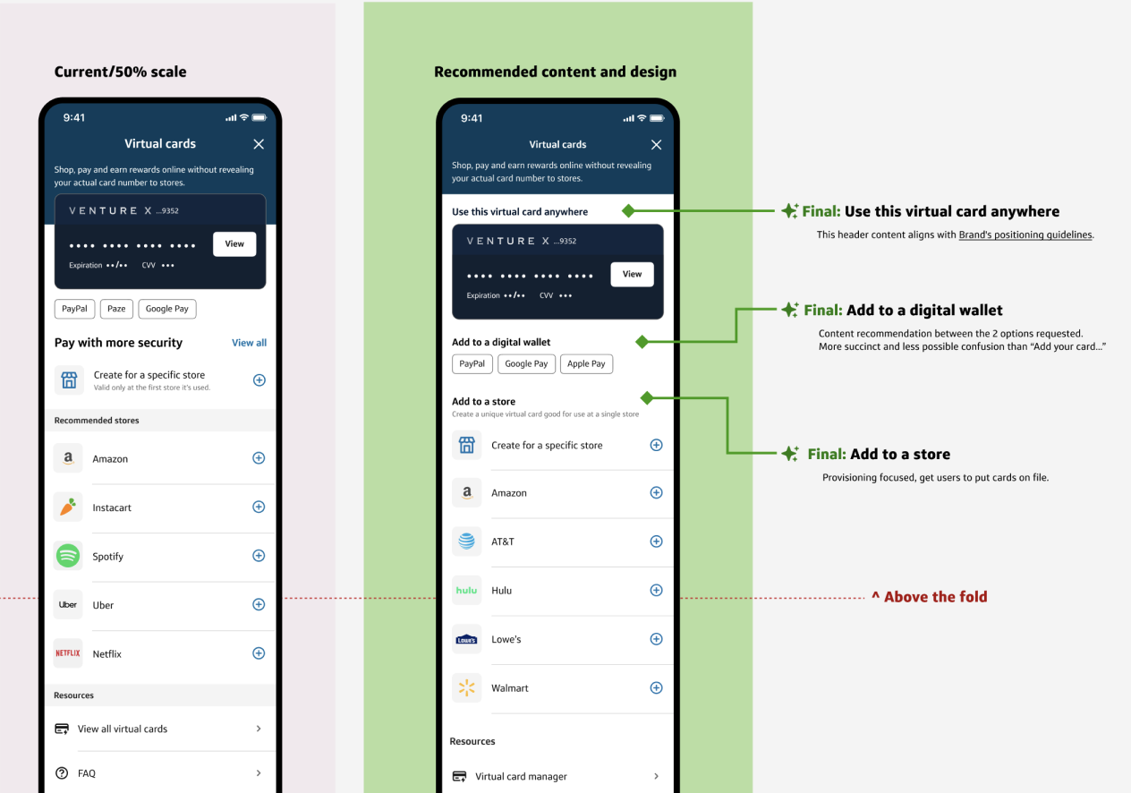
Insight: Virtual card home did not have proper zoning and information hierarchy which led to education getting muddled together.
- Digital wallets needed more clarity and affordance.
- The page needed more differentiation between the virtual card at the top of the page compared to the ones the customer creates for specific stores.
Solution:
- Increase negative space on the page for more visual balance.
- Add headers to further educate the customer on the value of each section with action forward verbs.
Impact: Evaluating in market. Results to come.